Dev Diary #3 - Edit Actions
Published 6 Jun 2017 | Category: Dev DiaryThis week's focus has been on implementing and refining the user experience for some of the core edit actions for Steps and Goals, as demonstrated below:
As could be guessed from some of the styling inconsistencies, I'm still at the stage of playing around with different types of input and design schemes, to get a feel for what I do and don't like.
Fortunately for Android I've been able hook into the native date and time selection widgets that the platform offers, so that will provide a familiar experience for anyone on Android. I still need to come up with something I'm happy with for iOS, but at least this is solved for one platform.
The presentation of the edit actions is also a neat example of somewhere the UI design will diverge quite significantly between the web-app and the new mobile apps. It's not anything to do with this way being "newer and better" -- it's more a case of the web-app's desktop-first design, and the new apps' mobile-first design, leading to different interaction patterns making the most sense.
If you've used the Nach web-app, you'll be familiar with the "shortcuts menu" that can be triggered from the Goal Map or the To-Do List, without needing to open up the full editing form. The shortcuts menu pops up in-place, showing several action buttons, some of which can be expanded to reveal further options.
This pattern works great on a desktop, because there's enough room to neatly present all of these options, while still preserving the context of the rest of the screen. You can still see all the surrounding steps, the parent goal, and so on, while making quick edits.
On mobile however, this pattern doesn't transfer cleanly. Due to the much reduced screen space, the shortcuts menu takes up the majority of the screen space, leaving practically no room for visible context. And a lot of the time, the positioning of the menu won't be ideal, requiring scrolling to access all of the options. The shortcut menu on the current web-app is far from ideal to use on mobile.
That's why for the native mobile apps, this flow has been expanded out into several connected screens. The difference is illustrated below.
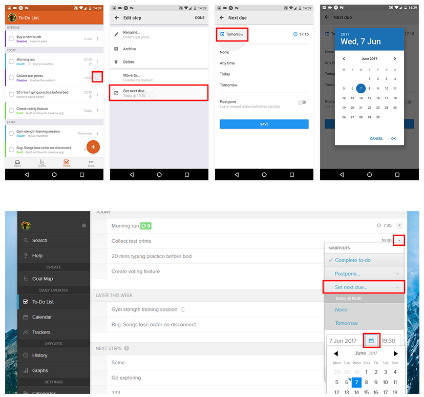
This was a tricky decision for me, as I'm so used to the quick-edit actions being a minimal set of options that appear overlaid as part of the page. But having played around with this new style quite a bit, I'm pretty confident that having a predictable hierarchy of simple screens is a lot more easy and efficient to use than the more intricate expanding tree of options used on desktop. Everything is a couple of taps away, and the familiar platform gestures (the back button on Android, a swipe from the screen left on iOS) can be used to easily back out if needed.
Another side effect of the edit shortcuts being expanded out into their own screen, is that I'm now thinking this can become the only form of editing on mobile. Rather than having options split between two places (shortcuts and the edit form), all actions can have their own button on the main list. Again, this makes sense on mobile, as it's more manageable to be editing one thing at a time, rather than having a big form of options that scrolls 5x the height of the phone.
This is clearly quite a significant change though, so I'll be careful to listen to feedback over the early access period before completely committing to this approach.
Stay updated:
RSS FeedCategories:
- All Posts
- Dev Diary ( 6 )
- New Features ( 12 )
- Theory ( 4 )
Share this article: