Dev Diary #6 - Beta Waiting List, Trackers, and Syncing
Published 16 Jul 2017 | Category: Dev DiaryThe irony isn't lost on me that while writing a blog series on the development of a personal organisation/task management app, I'm managing to consistently fall short of my self-imposed target of publishing a new entry every Friday. Despite turbulence in the planning, consistent progress is being made, and we're moving closer to a release.
If you haven't spotted it already, a waiting list is now open for the mobile app beta, with a flashy new splash page to boot. As the survey questions would suggest, I'm planning a staggered launch of the beta, gradually bringing on more users, as the app becomes more refined. This should help keep the later stages of the development process more "agile", incorporating feedback from a range of users, and avoiding any nasty surprises from opening the floodgates to an app which hasn't been tested against any real audience.
On the features front, trackers are now supported. Not 100% satisfied with these designs yet, so want to give them another shot soon, but glad to discover that SVG drawing techniques are working well in React Native, so I'll be able to reuse many of the same techniques I've been using for graphs on the web.
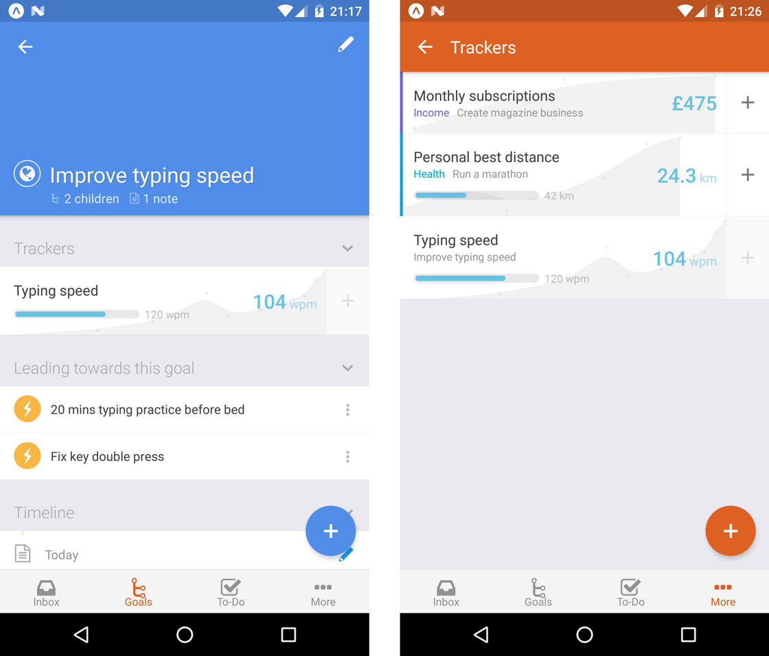
This is the first feature where I've intentionally stopped short of implementing the full scope of what's available on the web. For now, the only tracker functionality available through the app is adding a new reading. The whole aspect of viewing/managing historing readings, and changing the behaviour of trackers, I'm not really convinced is part of the core mobile experience.
Being able to add tracker readings quickly while on the go was sorely needed, but the more administrative tasks I imagine are better suited to a desktop computer and a larger screen. Even longer term, I'm not sure it makes sense replicating the full scope of the desktop app to mobile. I'll see what feedback I receive on this.
One more thing I've been concentrating on recently is further polishing the syncing. One of my targets for even the first beta release is perfect 2-way interop between the web app and the new mobile app, i.e. changes made on one will seamlessly reflect on the other. This is tricky because the two have significant differences in their architecture, so this behaviour is far from symmetrical. Eventually I'll be bringing the web-app more in-line with how the mobile app functions (so it will also support undo etc.), but for now this means covering a lot of edge-cases to make the two compatible.
Dev Diary #5 - Note Editor and Undo
Published 28 Jun 2017 | Category: Dev DiaryHad a lot on the past couple of weeks, so have had to skip an update. To make up for it, this is a pretty substantial one. The video mostly speaks for itself:
As you can see, much of the support is now in place for notes and attachments. For the same reasons as explained in diary #3, I've gone for a full screen note editor in the new mobile apps, and I'm finding it's a really nice way to focus in on a single note, removing the surrounding distractions.
This video also introduces a big new feature: undo. This isn't just for notes, it's something that appears everywhere in the app a mutation is made. Renaming a goal, completing a to-do, changing a due due, even deleting an entire tree of nested sub-goals, will now all include a 5-second undo window.
This was highly requested for the web app, but due to the architecture it was built with, it would have been extremely difficult to retrofit. But as described in diary #4, the brand new architecture in use by the mobile apps allows for a lot of new benefits, this being one of them.
Dev Diary #4 - Moving to Offline-First
Published 11 Jun 2017 | Category: Dev DiaryMoving on to the fourth in this series of Friday updates, they're inching ever closer to actually being ready to publish on a Friday (it will get there one day!).
While all the updates so far have been focused around visual and interaction design, to explain this week's progress we'll have to dive a level deeper -- to something much less apparent on the surface, but absolutely fundamental for providing a worthy experience for mobile: the move to offline-first. Why & how? Read on to find out.
Over time it's become increasingly obvious to me (both through my own experience and extensive feedback!) that with something as core to one's life as goal and task management, the medium used to manage it should ideally be accessible at any moment.
Whether it's a sudden flash of inspiration on how to move forward that needs to be recorded before it's forgotten, some reference notes that need to be accessed immediately in the heat of the moment, or just an overwhelming urge to review and reorganise one's plans during the daily commute, there are countless examples that disprove the notion that Nach should be solely used on a desktop or laptop with a stable Internet connection.
By definition, a great offline-first experience is seamless. Whether an Internet connection is available or not becomes a detail irrelevant to the user, which the app abstracts away, internally making sure information syncs in both directions when possible, without any need for user intervention. But despite giving this illusion of simplicity, it introduces heaps of new challenges behind the scenes.
The original Nach web-app opted for a more straightforward approach (to be honest, offline support wasn't even on my radar at the time). The server (a beefed up central computer and database, which stores and manages everyone's data) does a large amount of the work in providing the app. When a user visits the web-app, their web browser sends a request over to the server for the most up-to-date version of their goals, steps, trackers and so on. Once the user has their data, the server subsequently waits patiently to receive back any requests for changes.
Shortly after launch I added support for web-sockets, a technology allowing any changes the server receives to be broadcast out to all other instances of the app the user has open, instantaneously. So any version of the app the user has open, across any number of devices, should always remain up to date with the others.
This system works well, but with a significant caveat: it requires a stable Internet connection. As you may have experienced trying to make changes on the app during a period of no connectivity, you'll be greeted with the dreaded red box error message informing you to reload the app because your changes may not have been saved.
This is because, as soon as it's no longer able to talk to the server, the web-app essentially becomes lost, like a child who's wandered into the wrong aisle of the supermarket, who decides its best course of action is to stay put and wait for an adult. More technically: there are several things the web-app can't figure out without the help of the server; both the app and the server need to hear about updates as they happen, or they'll fall into inconsistent states; and the app doesn't know what to do with updates if it can't just tell the server about them.
Setting out to solve this is one of the main influences that motivated a ground-up rewrite for the mobile apps. Yes, our lost-in-the-supermarket web-app could have, with the right parental guidance, have one day grown up to be able to navigate supermarkets on its own. But that would take years, and when the option of adopting a supermarket-born native is on the table, who knows the route from frozen produce to baking supplies like the back of his hand, that becomes an awfully tempting option.
As I mentioned, there have been many new challenges faced when trying to build up a solid foundation for offline support. The fundamentals are straightforward enough: everything needed to use the app will now be cached offline on your phone; the app will gain all the functionality it needs to be able to carry out key actions without a server; and when changes are made, the app will store up a list of these changes, ready to be sent to the server when a connection is available.
But as with anything, the devil is in the detail. There are so many edge cases that require careful consideration to really make the system watertight. How can changes be resolved coming in from a device which has been offline for days, while other changes have been made elsewhere? What happens if a user makes overlapping changes to the same item from 2 devices before syncing? How can a user who has built up years of data keep within the much more limited storage and processing capabilities of a mobile device?
Of course, there's a lot of fun in coming up with neat solutions to challenges like these. I've developed and been playing around with a system which I'm really happy with as a starting point for this, which nicely handles many of these edge cases.
The ultimate goal is for changes to be accepted from any device, with the proper intention derived, no matter how long that device has been offline, or how much has happened since from other sources. There's a long way to go to reach that, but I'm really looking forward to getting out the first beta out, so people can start using Nach quickly and responsively, no matter where they are.
Dev Diary #3 - Edit Actions
Published 6 Jun 2017 | Category: Dev DiaryThis week's focus has been on implementing and refining the user experience for some of the core edit actions for Steps and Goals, as demonstrated below:
As could be guessed from some of the styling inconsistencies, I'm still at the stage of playing around with different types of input and design schemes, to get a feel for what I do and don't like.
Fortunately for Android I've been able hook into the native date and time selection widgets that the platform offers, so that will provide a familiar experience for anyone on Android. I still need to come up with something I'm happy with for iOS, but at least this is solved for one platform.
The presentation of the edit actions is also a neat example of somewhere the UI design will diverge quite significantly between the web-app and the new mobile apps. It's not anything to do with this way being "newer and better" -- it's more a case of the web-app's desktop-first design, and the new apps' mobile-first design, leading to different interaction patterns making the most sense.
If you've used the Nach web-app, you'll be familiar with the "shortcuts menu" that can be triggered from the Goal Map or the To-Do List, without needing to open up the full editing form. The shortcuts menu pops up in-place, showing several action buttons, some of which can be expanded to reveal further options.
This pattern works great on a desktop, because there's enough room to neatly present all of these options, while still preserving the context of the rest of the screen. You can still see all the surrounding steps, the parent goal, and so on, while making quick edits.
On mobile however, this pattern doesn't transfer cleanly. Due to the much reduced screen space, the shortcuts menu takes up the majority of the screen space, leaving practically no room for visible context. And a lot of the time, the positioning of the menu won't be ideal, requiring scrolling to access all of the options. The shortcut menu on the current web-app is far from ideal to use on mobile.
That's why for the native mobile apps, this flow has been expanded out into several connected screens. The difference is illustrated below.
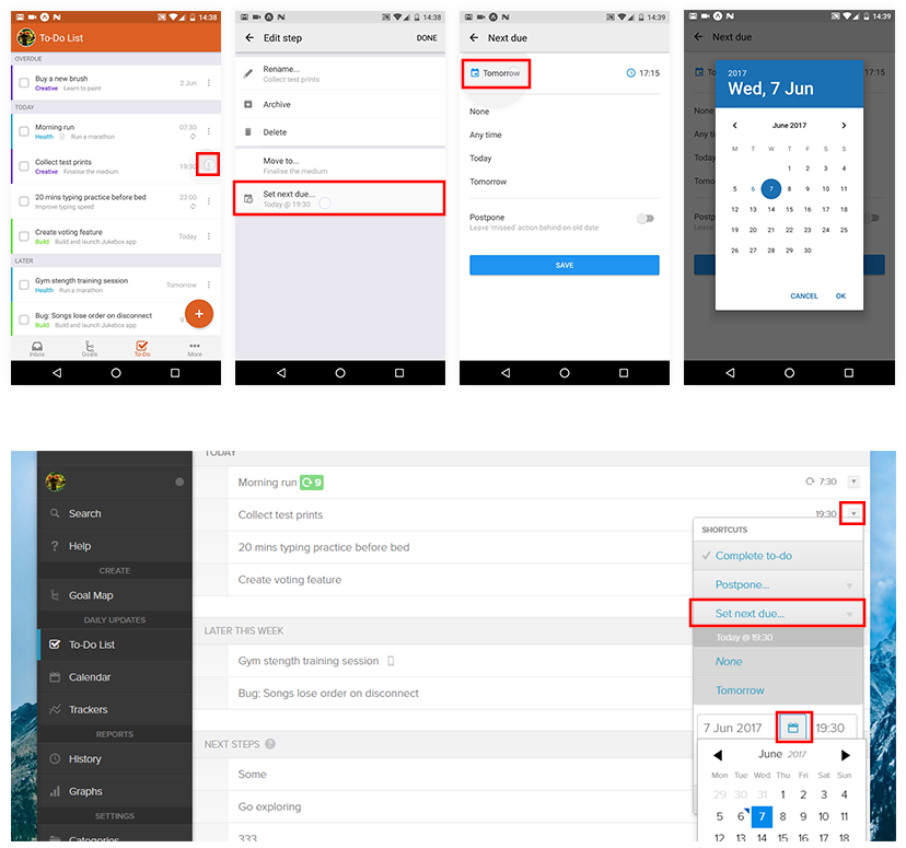
This was a tricky decision for me, as I'm so used to the quick-edit actions being a minimal set of options that appear overlaid as part of the page. But having played around with this new style quite a bit, I'm pretty confident that having a predictable hierarchy of simple screens is a lot more easy and efficient to use than the more intricate expanding tree of options used on desktop. Everything is a couple of taps away, and the familiar platform gestures (the back button on Android, a swipe from the screen left on iOS) can be used to easily back out if needed.
Another side effect of the edit shortcuts being expanded out into their own screen, is that I'm now thinking this can become the only form of editing on mobile. Rather than having options split between two places (shortcuts and the edit form), all actions can have their own button on the main list. Again, this makes sense on mobile, as it's more manageable to be editing one thing at a time, rather than having a big form of options that scrolls 5x the height of the phone.
This is clearly quite a significant change though, so I'll be careful to listen to feedback over the early access period before completely committing to this approach.
Dev Diary #2 - Animation
Published 30 May 2017 | Category: Dev DiaryQuick house-keeping note on this diary series. When I started it, I didn't really put any thought into a schedule, which probably wasn't wise. I'm now aiming to get one out each Friday, to cover the previous week's progress. Now on to the content...
If you watch closely while using the Nach web app, you'll notice many of your interactions are immediately followed by brief animations, to break up what would otherwise be very abrupt transitions, as parts of the page come into or out of view. It's a subtle effect, but I think it goes a long way to make the UI feel smooth and intuitive.
The new native mobile apps will be no exception here. In fact, now that they're going native, there should be even more freedom for creating fluid animations, over what was possible on the web. Here's a taster:
When used correctly, animations can introduce a new dimension to the design of apps -- one of motion over time. Rather than thinking of app designs as simply a series of 2D screens, as you'd see in screenshots, I find it helpful to try and consider the transitions and movement as part of the core design.
There's an important balance to strike here, which I'm always wary of when introducing animations. An animation needs to last long enough that the eye can pick up what's going on, even if it's completely subconscious (which is ideal).
But there's a very fine line. If it's too slow, and the viewer's own reaction times are outpacing the motion of the animation, this can quickly turn the animation into a hinderance, making the whole experience feel laggy and slow.
Even if it's just an excess 200 milliseconds, if that's time where the user is ready and waiting for a button to appear, but having to sit through needlessly slow fade, these minor annoyances can add up, making the whole app experience feel sluggish rather than fast and responsive. I do manually check every single animation, and will meticulously tweak until the timing feels right.
The technology choice for our iOS and Android apps are the perfect fit fo this. Animation is able to happen on a very low level, meaning that gesture responses are essentially instant, and everything animates at a "buttery smooth" 60 frames per second (twice as fast as the included video is able to demonstrate).
So, expect plenty more instances of animation to make an apperance over the coming weeks.
Stay updated:
RSS FeedCategories:
- All Posts
- Dev Diary ( 6 )
- New Features ( 12 )
- Theory ( 4 )
Posts:
- Dev Diary #6 - Beta Waiting List, Trackers, and Syncing
- Dev Diary #5 - Note Editor and Undo
- Dev Diary #4 - Moving to Offline-First
- Dev Diary #3 - Edit Actions
- Dev Diary #2 - Animation
- Dev Diary #1 - First Look at Nach for iPhone and Android
- Review Your Year with the Calendar Chart
- No Goals?
- Calendar Receives an Interactive Overhaul
- Next Steps: The Tipping Point Towards Progress
- Restructure your Goal Map with Drag & Drop
- Opening our Product Roadmap
- Real-Time Sync
- Introducing the Inbox and Quick-Add Shortcuts
- Account-Wide Search
- Bring Your Goals to Life with Cover Images
- Thinking Big with Nach
- An Enhanced Shortcut Menu
- Quantifying Productivity with Nach
- Habits: A New Type of Step
- Introducing Category Tabs
- The Achievement Loop: Plan, Execute, Review